
Interactive Dashboards & Web Apps
Since 2014, we've been building custom R and Shiny dashboards that turn complex nonprofit data into tools people actually use. Not reports that sit in inboxes. Not spreadsheets that require a decoder ring. Real, interactive applications your team can rely on.
From donor retention tracking to program outcome dashboards, we handle the full build: data preparation, quality checks, user-friendly design, and the documentation to keep it running long after we're done.
Portfolio
-
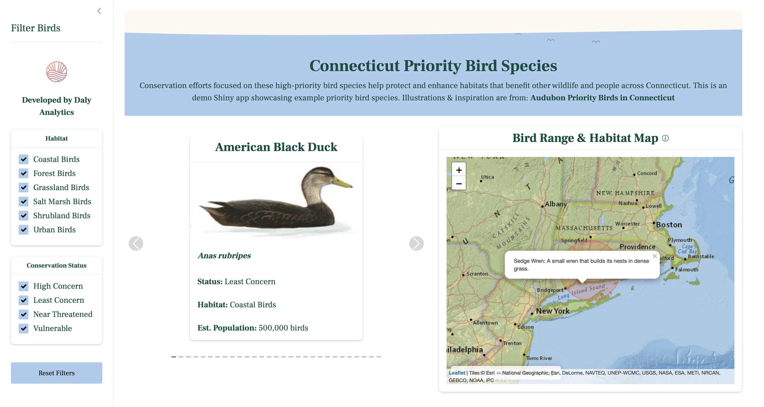
![A webpage dedicated to Connecticut priority bird species features a section on the American Black Duck, showing a side view illustration of the duck. To the right, there is a map of Connecticut with a pop-up label explaining the Sedge Wren as a small wren that builds nests in dense grass.]()
Connecticut Priority Bird Species Explorer
Conservation efforts focused on these high-priority bird species help protect and enhance habitats that benefit other wildlife and people across Connecticut. Showcasing custom animation, brand theming, and CSS enhancements that thoughtfully improve the user experience.
-
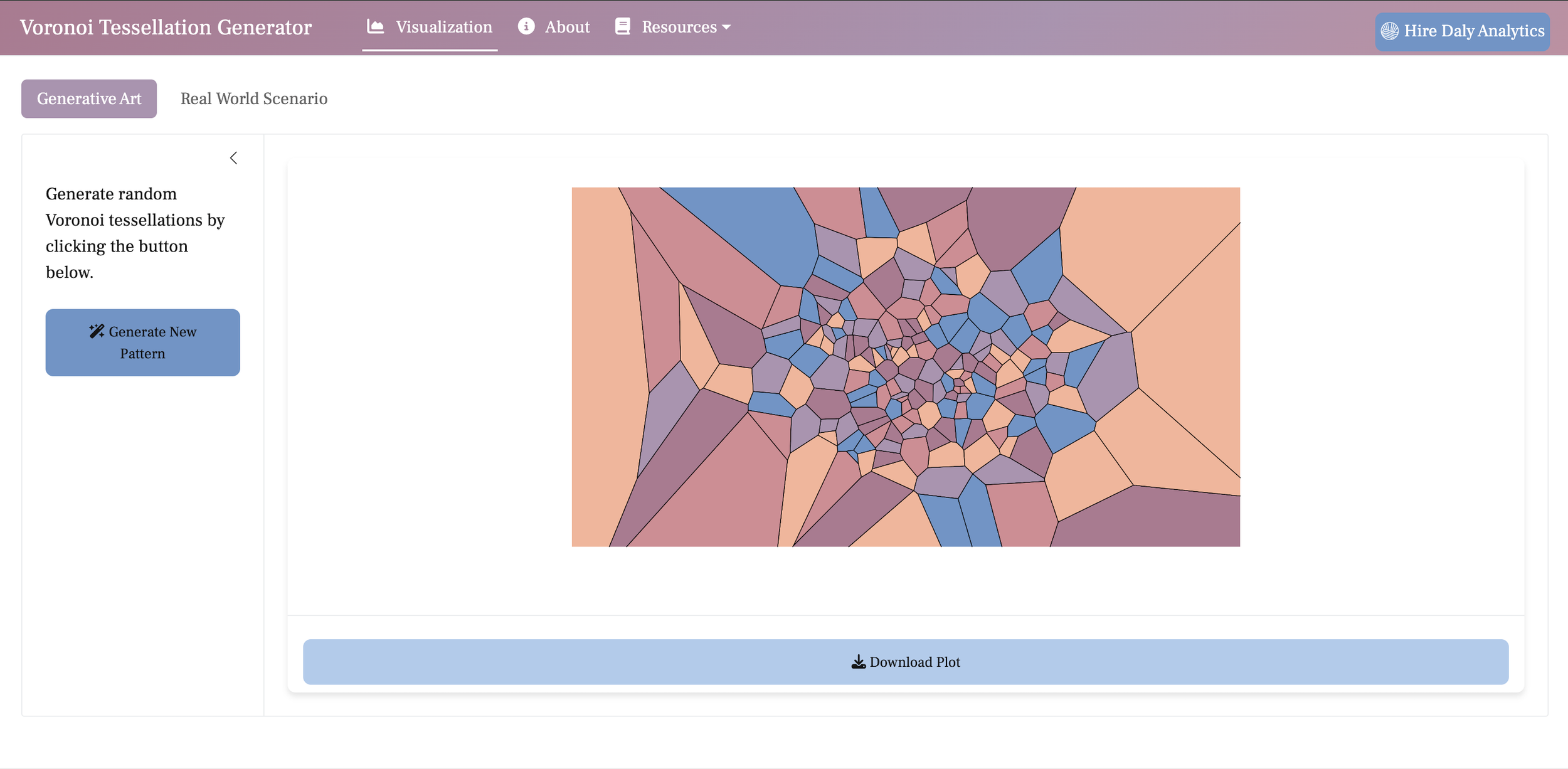
![Screenshot of a webpage featuring a Voronoi tessellation generator. The page includes a colorful tessellation pattern with polygonal shapes in shades of blue, pink, and purple. Options for generating new patterns and downloading plots are visible.]()
Voronoi Tessellation Explorer: Generative Art & Real-World Applications
Explore the mathematical and practical significance of Voronoi tessellations through both generative art and real-world case studies. This application demonstrates how Voronoi diagrams can visually partition space based on proximity, with use cases ranging from artistic design to the optimization of resource allocation, such as in the mapping of urgent care coverage areas.
-
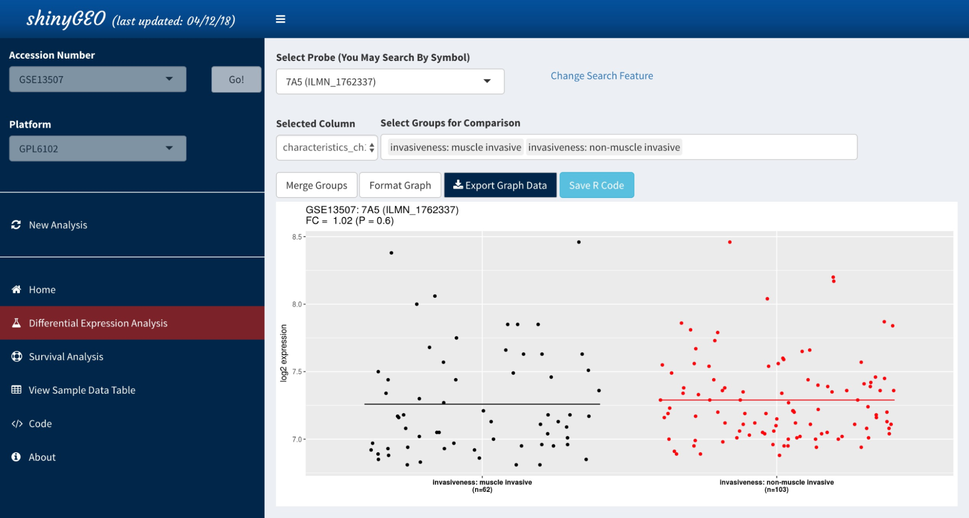
![shinyGEO]()
Differential Gene Expression & Survival Analysis App
Analyze expression and sample data from a Gene Expression Omnibus dataset, select a gene of interest, and perform a survival or differential expression analysis. For both analyses, shinyGEO produces publication-ready graphics and generates R code ensuring that all analyses are reproducible.
-
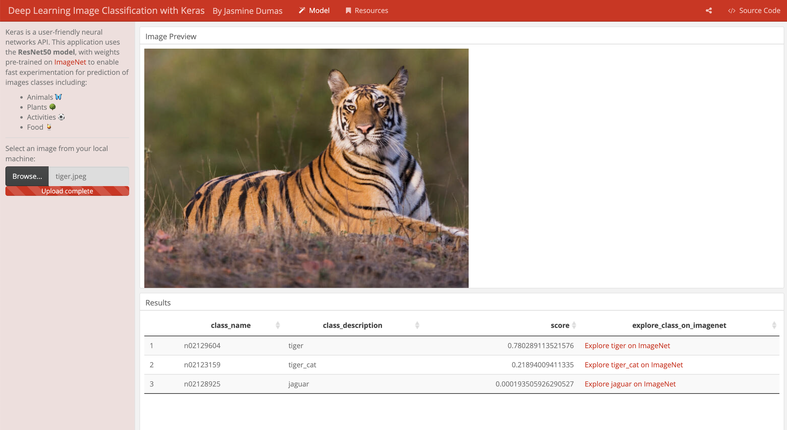
![Screenshot of a deep learning image classification application using Keras. It shows an image of a tiger in natural surroundings, with classification results indicating high confidence for "tiger."]()
Deep Learning Image Classification App
A shiny web application leveraging {keras}, a user-friendly neural networks API to enable a user to upload an image and have it classified.
-
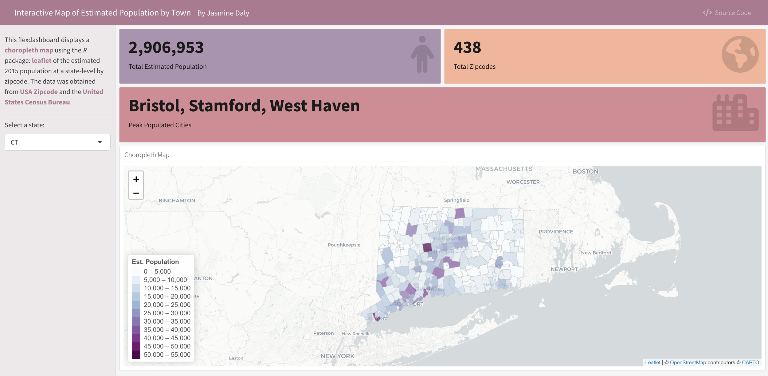
![Interactive map displaying estimated population by town in Connecticut, using a choropleth style and OpenStreetMap data. The sidebar shows total estimated population of 2,906,953 and 438 total zip codes, highlighting cities like Bristol, Stamford, and West Haven. Legend shows population ranges.]()
Interactive Map of US Population by Zipcode Dashboard
This {flexdashboard} displays a choropleth map using {leaflet} & {shiny} for the estimated US 2015 population at a state-level by zipcode.
-
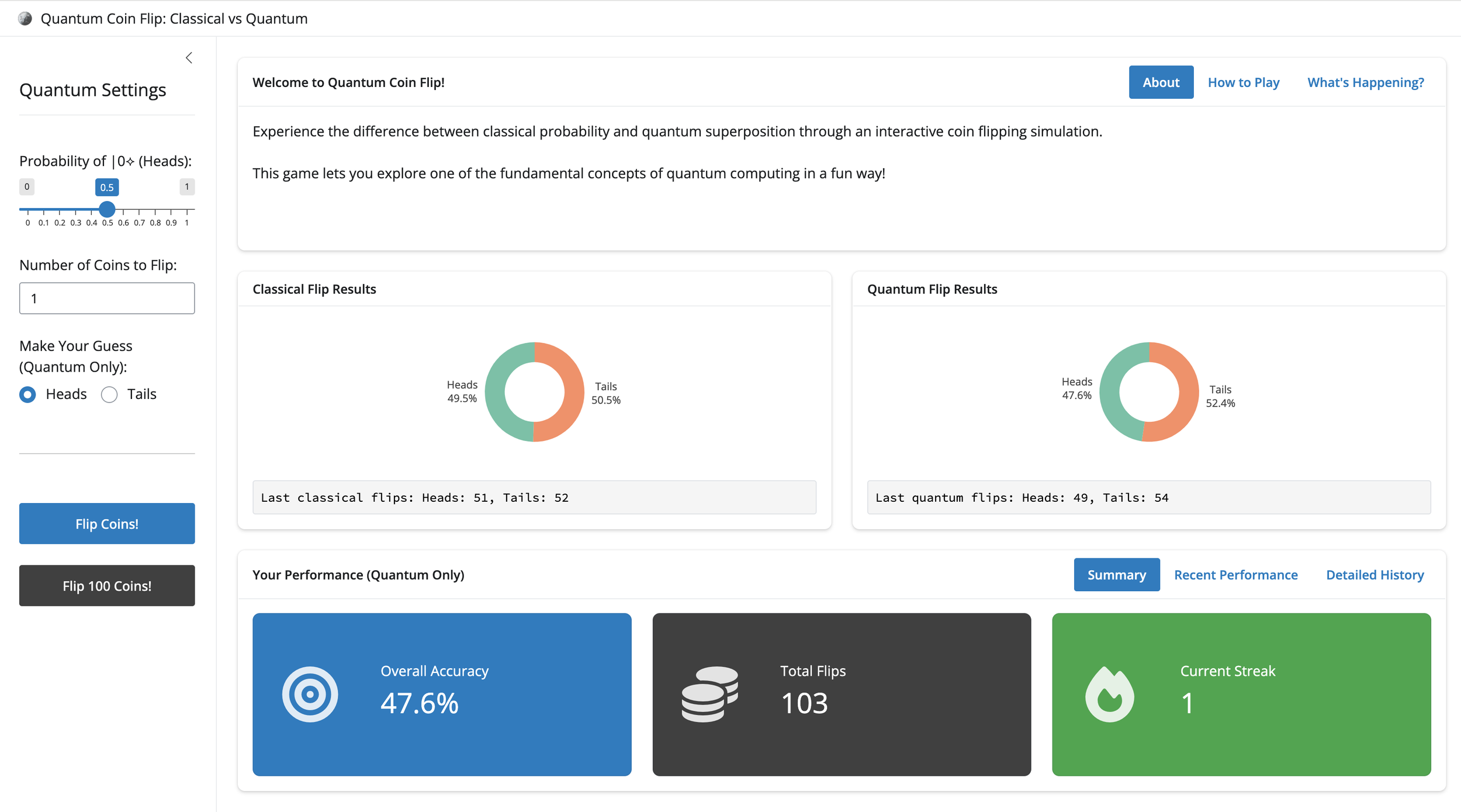
![Screenshot of an online quantum coin flip simulator showing classical and quantum flip results, with pie charts displaying flip outcomes, performance stats, and options to flip coins or view detailed history.]()
Quantum Coin Flip Simulation Game
Experience the difference between classical probability and quantum superposition through an interactive coin flipping simulation.
-
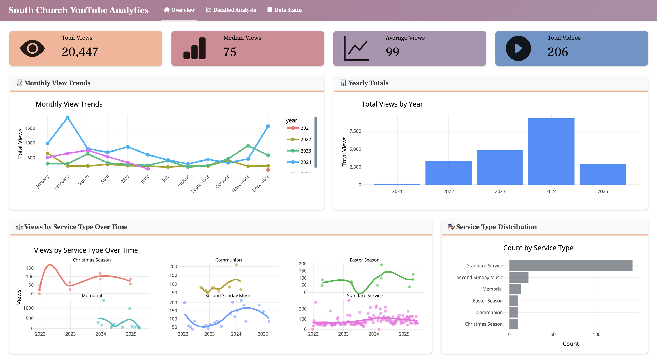
![Dashboard titled 'South Church YouTube Analytics' displaying various charts and metrics. Top section shows total views (20,447), median views (75), average views (99), and total videos (206). The left chart shows monthly view trends for 2021-2024. The middle chart displays total views by year from 2021 to 2025. The bottom section includes three line charts illustrating views over time by service type during Christmas, Communion, and Easter seasons, and a bar chart indicating the count of videos by service type, with the most videos in 'Standard Service' and 'Second Sunday Music.']()
YouTube Analytics Dashboard for Church Livestream Videos
YouTube analytics dashboard with real-time data & refresh capabilities. Showcasing async programming, rate limiting, interactive visualizations, and custom data cleaning.

Questions We Help You Answer
Whether it's for your board, your team or your community partners - these are the questions that shape a good build.
How do we stop reporting from eating 20 hours a month?
Why it matters: Manual reporting is expensive and soul-crushing. Your team has better things to do than copy-pasting into Excel.
- Automated data connections that refresh on schedule
- Interactive visualizations that replace static exports
- Filters and drill-downs so stakeholders self-serve
Can we build something our team will actually use?
Why it matters: Dashboards fail when they're built for executives but used by program staff. Design has to match reality.
- User research to understand who's actually using this
- Intuitive, responsive design that works on any device
- Training so your team feels confident, not confused
Will this still work when we have 10x the data?
Why it matters: You've outgrown tools before. The last thing you need is another system that chokes when your org grows.
- Performance optimization for large datasets
- Smart caching so dashboards load fast
- Architecture designed to scale with you
Is this going to be a real product or just a prototype?
Why it matters: You've seen the dashboard that worked great in the demo but fell apart in production. You need something your org can rely on for years, not months.
- Production-grade code, not a proof of concept
- Documentation and SOPs so anyone can maintain it
- Version control and proper infrastructure from day one